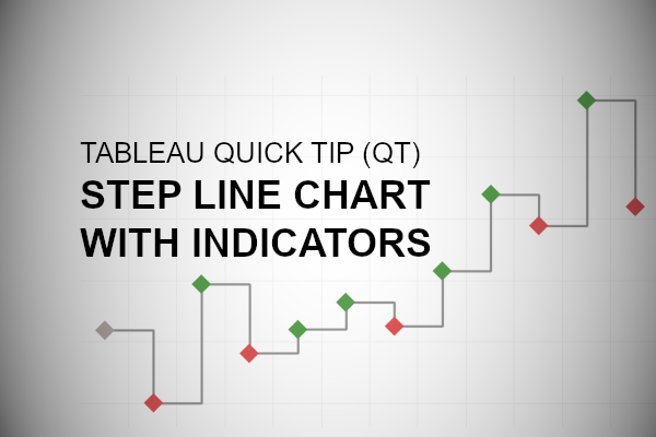
Something nice and simple. In this Tableau quick tip, we are going to walk through the creation of a Step Line Chart within Tableau in 5 minutes or less.
Data
We will start by loading the following data into Tableau Desktop / Tableau public.
Note: If you have Tableau Desktop, you can use the Sample data source, but if you are using Tableau Public, download and load the following data source.
Calculated Fields
We only need a single Calculated Field for our Data Visualisation.
Color
IF SUM([Sales]) > LOOKUP(SUM([Sales]),-1) THEN
    "Up"
ELSEIF SUM([Sales]) < LOOKUP(SUM([Sales]),-1) THEN
    "Down"
ELSE
    "No Movement"
END
With this done, let us start creating our data visualisation.
Worksheet
We will now build our worksheet:
- Change the Mark Type to Line
- Drag Order Date onto the Filter Shelf and select 2018
- Drag Order Date onto the Column Shelf
- Right-click on this pill and convert this to a Discrete Month
- Drag Sales onto the Rows Shelf
- Click on the Path Mark and change the Line Type to Step
If all goes well, you should now see the following:

We will now add our indicators.
- Drag Sales onto the Rows Shelf
- In the Sum(Sales) 2 Marks Panel (second Sales Mark)
- Change the Mark Type to Shape, click on the Shape Mark and select the Filled Diamond
- Drag Color onto the Color Mark
- Click on the Color Mark and set the following colors:
- Up to Green
- Down to Red
- No Moment to Grey
- Click on the Color Mark and set the following colors:
- Right-click on the Second SUM(Sales) pill and select Dual Axis
- Right-click on the Sales Axis and select Synchronize Axis
You should now see the following:

We will now adjust the cosmetics:
- Set the Date Format to abbreviation and rotate the date header
- Edit the Tooltips
- Format the Sales values
You will want to have something like the following:

and boom, we are done… I hope you enjoyed this tutorial, and as always, you can find this data visualization on Tableau Public at https://public.tableau.com/profile/toan.hoang#!/vizhome/StepLineChartwithIndicators/StepLineChartwithIndicators
Note: try out animations, it is super cool.
Summary
I hope you all enjoyed this article as much as I enjoyed writing it and as always do share the love. Do let me know if you experienced any issues recreating this Visualization, and as always, please leave a comment below or reach out to me on Twitter @Tableau_Magic. Do also remember to tag me in your work if you use this tutorial.
If you like our work, do consider supporting us on Patreon, and for supporting us, we will give you early access to tutorials, exclusive videos, as well as access to current and future courses on Udemy: https://www.patreon.com/tableaumagic


[…] Источник: tableaumagic.com […]