B20. Finding Inspiration
We are going to talk about the various sources of inspiration that is at your disposal. You can find inspiration anywhere you look, you just have to pay attention, be aware, be open and let it come to you.
B19. Introducing Design
In this section, we will talk about finding inspiration, sketching and designing your Bespoke Data Visualisations in Tableau.
B18. Core Technique Summary
We have covered a lot of grounds and have learned some of the available core techniques that we require to build bespoke data visualisations. So let us review.
B17. Additional Bespoke Data Visualizations
We have now learned quite a lot and practice does make perfect. Please follow the links below and complete the various exercises to reinforce your knowledge and learned techniques.
B16. Drawing a Radial Bar Chart
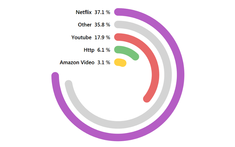
In this video, we will be creating a Radial Bar Chart in Tableau. We will be using Data Densification and leveraging various Table Calculations in our bespoke data visualisation.
B15. Drawing a Packed Circle
In this lecture, we will be reinforcing our knowledge on our learned techniques to create a Packed Circle Chart in Tableau. We will be drawing circles and sizing them based on our data set.
B14. Drawing with Polygons / Circles
In this lecture, we will be looking at using Data Densification, Table Calculations and the Polygon Mark Type to draw shapes. We will combine all our techniques to draw a few fun shapes and will be building up to drawing more complex objects.
B13. Drawing a SIN Graph
In this lecture, we are going to look into the drawing curved lines using the SIN() Function. We will use Data Densification, Table Calculations and the SIN() function to draw this data visualisation. This lecture will help cement our knowledge on the techniques presented.
B12. Shaped Bar Charts
In this lecture, we are going to build our first, albeit simple, bespoke data visualisation to get a better understanding of Data Densification and Table Calculations. We will be building a Shaped Bar Chart which is a nice alternative to your standard Bar Chart.
B11. Data Densification
In this lecture, we are going to look into the technique of Data Densification; this technique allows us to take two points and create additional points between for manipulation, so in essence, making our data more dense.

