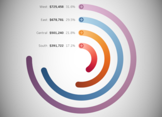
I do not believe that everything you do in Tableau has to be serious, and sometimes, just sometimes, it is good to have some fun. As such, we are going to draw five different Google product logos in Tableau and hopefully see some new techniques while we are at it. Before you get started, have a quick read through and install the Google Material Design Palette: https://tableau.toanhoang.com/google-material-design-palette.
1. Google Analytics
Google Analytics is a freemium web analytics service offered by Google that tracks and reports website traffic, currently as a platform inside the Google Marketing Platform brand. Google launched the service in November 2005 after acquiring Urchin.
Google Analytics is now the most widely used web analytics service on the web. Google Analytics also provides an SDK that allows gathering usage data from iOS and Android Apps, known as Google Analytics for Mobile Apps.
Data Source
Load the following into Tableau Desktop / Public.
| Line | X | Y |
| A | 0 | 0 |
| A | 0 | 0 |
| B | 0.5 | 0 |
| B | 0.5 | 0.5 |
| C | 1 | 0 |
| C | 1 | 1 |
Worksheet
- Drag X onto Columns.
- Right-click and select Dimension.
- Drag Y onto Rows.
- Right-click and select Dimension.
- Drag Line onto Color.
- Create a calculated field called Size as
WINDOW_MAX(MAX(100)). - Drag Size onto Size.
- Adjust the cosmetics by:
- Removing gridlines.
- Edit the Color using the Material Design Palette.
- Edit the Size to match.
You want to have something like the following:

Learn more about Google Analytics here: https://analytics.google.com
Twitter here: https://twitter.com/googleanalytics
2. Google AdSense
Google AdSense is a program run by Google that allows publishers in the Google Network of content sites to serve automatic text, image, video, or interactive media advertisements, that are targeted to site content and audience. These advertisements are administered, sorted, and maintained by Google. They can generate revenue on either a per-click or per-impression basis.
Data Source
Load the following into Tableau Desktop / Public.
| Line | X | Y |
| A | 0 | 0 |
| A | 0 | 0 |
| B | 0 | 0 |
| B | 0.5 | 1 |
| C | 0.5 | 1 |
| C | 1 | 0 |
Worksheet
- Drag X onto Columns.
- Right-click and select Dimension.
- Drag Y onto Rows.
- Right-click and select Dimension.
- Drag Line onto Color.
- Right-click on Line and select Sort…
- Manual sort and make the order: A, C, B.
- Create a calculated field called Size as
WINDOW_MAX(MAX(100)). - Drag Size onto Size.
- Adjust the cosmetics by:
- Removing gridlines.
- Edit the Color using the Material Design Palette.
- Edit the Size to match.
You want to have something like the following:

Learn more about Google AdSense here: https://www.google.com/adsense
Twitter here: https://twitter.com/GoogleAds
3. Google Ad Manager
Google Ad Manager is an online advertisement service brand introduced by Google in June 27, 2018. It consists of two former services, including DoubleClick for Publishers (formerly known as DART for Publishers) and DoubleClick Ad Exchange.
Data Source
Load the following into Tableau Desktop / Public.
| Line | X | Y |
| Blue1 | -0.5 | 0 |
| Blue1 | 0 | 0.5 |
| Blue2 | -0.25 | -0.25 |
| Blue2 | 0 | 0 |
| Yellow1 | 0 | 0 |
| Yellow1 | 0.25 | 0.25 |
| Yellow2 | 0 | -0.5 |
| Yellow2 | 0.5 | 0 |
| Green1 | 0 | 0.5 |
| Green2 | 0 | 0 |
| Green3 | 0 | -0.5 |
Worksheet
- Drag X onto Columns.
- Right-click and select Dimension.
- Drag Y onto Rows.
- Right-click and select Dimension.
- Drag Line onto Color.
- Right-click on Line and select Sort…
- Manual sort and ensure that Green1, Green2 and Green3 are on top.
- Create a calculated field called Size as
WINDOW_MAX(MAX(100)). - Drag Size onto Size.
- Adjust the cosmetics by:
- Removing gridlines.
- Edit the Color using the Material Design Palette.
- Edit the Size to match.
You want to have something like the following:

Learn more about Google Ad Manager here: https://admanager.google.com
Twitter here: https://twitter.com/GoogleAdManager
4. Google AI
Google.ai is a division of Google dedicated solely to artificial intelligence. It was announced at Google I/O 2017 by CEO Sundar Pichai.
Data Source
Load the following into Tableau Desktop / Public.
| Name | X | Y |
| Small Blue | 1 | 2 |
| Small Blue | 1 | 3 |
| Small Blue | 1 | 4 |
| Red | 2 | 1.5 |
| Red | 2 | 2.5 |
| Red | 2 | 3.5 |
| Red | 2 | 4.5 |
| Yellow | 3 | 1 |
| Yellow | 3 | 2 |
| Yellow | 3 | 3 |
| Yellow | 3 | 4 |
| Yellow | 3 | 5 |
| Green | 4 | 1.5 |
| Green | 4 | 2.5 |
| Green | 4 | 3.5 |
| Green | 4 | 4.5 |
| Big Blue | 5 | 2 |
| Big Blue | 5 | 3 |
| Big Blue | 5 | 4 |
Worksheet
- Drag X onto Columns.
- Drag Y onto Rows.
- Drag Line onto Color.
- Right-click on Line and select Sort…
- Manual sort and ensure that Green1, Green2 and Green3 are on top.
- Create a calculated field called Size as
WINDOW_MAX(MAX(100)). - Drag Size onto Size.
- Adjust the cosmetics by:
- Removing gridlines.
- Edit the Color using the Material Design Palette.
- Edit the Size to match.
You want to have something like the following:

Learn more about Google AI here: https://ai.google
Twitter here: https://twitter.com/GoogleAI
5. Google Marketing Platform
Google Marketing Platform brings together DoubleClick Digital Marketing and the Google Analytics 360 Suite to help you plan, buy, measure and optimize digital media and customer experiences in one place. Google Marketing Platform helps you deliver more relevant and effective marketing, while ensuring that you respect your customers’ privacy and give them control over their data.
Data Source
Load the following into Tableau Desktop / Public.
| Color | Path | Starting Point | Value |
| Red | 1 | 45 | 0.25 |
| Red | 101 | 45 | 0.25 |
| Yellow | 1 | 135 | 0.25 |
| Yellow | 101 | 135 | 0.25 |
| Green | 1 | 225 | 0 |
| Green | 101 | 225 | 0 |
| Blue | 1 | 225 | 0.5 |
| Blue | 101 | 225 | 0.5 |
Worksheet
Let us start by creating some Calculated Fields and Bins.
- Right-click on Path, select Create and choose Bins…
- Set the Size of bins to 1.
- Click Ok.
- Create Index as
(INDEX()-1)*3.6. - Create Size as
WINDOW_MAX(MAX(100)). - Create TC_Starting Point as
WINDOW_MAX(MAX([Starting Point])). - Create TC_Value as
WINDOW_MAX(MAX([Value])). - Create X as
SIN((([Index]*[TC_Value])+[TC_Starting Point])*PI()/180). - Create Y as
COS((([Index]*[TC_Value])+[TC_Starting Point])*PI()/180).
Now let us create our Worksheet:
- Change the Mark Type to Line.
- Drag Color onto Color.
- Right-click on Color and select Sort…
- Choose Manual sort and ensure that Green is at the top followed by Blue, Red and finally Yellow.
- Drag Size onto Size.
- Drag Path (bin) onto Path.
- Drag Path (bin) onto Columns.
- Right-click on Path and make sure Show Missing Values is checked.
- Drag the Path object onto the Path Mark.
- Drag X onto Columns.
- Right-click on X, go to Compute Using, select Path (bin).
- Drag Y onto Columns.
- Right-click on Y, go to Compute Using, select Path (bin).
- Adjust the cosmetics by:
- Removing gridlines.
- Edit the Color using the Material Design Palette.
- Edit the Size to match.
You want to have something like the following:

Learn more about Google Marketing Platform here: https://marketingplatform.google.com
Twitter here: https://twitter.com/gmktgplatform
Summary
I hope you all enjoyed this article as much as I enjoyed writing it. Do let me know if you experienced any issues recreating this Visualisation, and as always, please leave a comment below or reach out to me on Twitter @Tableau_Magic.
If you like our work, do consider supporting us on Patreon, and for supporting us, we will give you early access to tutorials, exclusive videos, as well as access to current and future courses on Udemy:
- Patreon: https://www.patreon.com/tableaumagic
Also, do be sure to check out our various courses:
- Creating Bespoke Data Visualizations (Udemy)
- Introduction to Tableau (Online Instructor-Led)
- Advanced Calculations (Online Instructor-Led)
- Creating Bespoke Data Visualizations (Online Instructor-Led)

