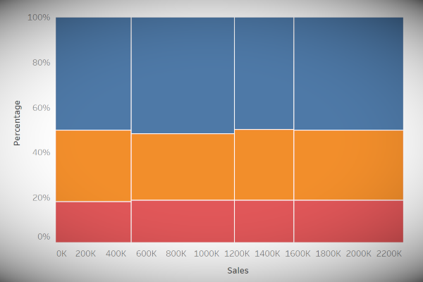
To close off there year, he is a quick and simple tutorial on creating a Marimekko Chart in Tableau. No data densification or any such data tricks. Just a few Table Calculations.
Note: This is an alternative type of data visualisation, and sometimes pushed for by clients. Please always look at best practices for data visualisations before deploying this into production.
Data
We will start by loading the Sample Superstore data into Tableau.
Note: If you have access to Tableau Desktop and the Sample Superstore data source, please use that instead.
Calculated Fields
With our data set loaded into Tableau, we are going to create the following Calculated Fields:
TC_Sales
WINDOW_SUM(SUM([Sales]))TC_Total Sales
WINDOW_SUM(SUM([Sales]))TC_Percentage of Total
[TC_Sales]/[TC_Total Sales]TC_Percentage of Region
[TC_Sales]/[TC_Total Sales]TC_Starting Point
RUNNING_SUM([TC_Total Sales])-[TC_Total Sales]With this done, let us start creating our data visualisation.
Worksheet
We will now build our first worksheet:
- Change the Mark Type to Bar.
- Drag Segment onto the Colour Mark.
- Drag Region onto the Detail Mark.
- Drag TC_Starting Point onto the Columns Shelf.
- Drag TC_Percentage of Region onto the Rows Shelf.
You should see the following:

We will now edit our Table Calculations.
- Right-click on TC_Starting Point.
- In Nested Calculations select TC_Total Sales.
- In Compute Using select Specific Dimensions. Ensure that Segment and Region are selected and that Segment is on top.
- In At the level select Segment.
- In Nested Calculations select TC_Starting Point.
- In Compute Using select Specific Dimensions. Ensure that only Region is selected.
- In Nested Calculations select TC_Total Sales.
- Right-click on TC_Percentage of Region.
- In Nested Calculations select TC_Sales
- In Compute Using select Cell
- In Nested Calculations select TC_Total Sales.
- In Compute Using select Specific Dimensions. Ensure that only Segment is selected.
- In Nested Calculations select TC_Sales
You want to have the following:

We are getting closer and now will adjust the width of our bar charts. Drag TC_Total Sales onto the Size Mark and you should now see the following:

Now we will adjust our cosmetics::
- Drag TC_Percentage of Region onto the Tooltip Mark and adjust. the Table Calculation.
- In Nested Calculations select TC Sales, and in Compute Using select Cell.
- In Nested Calculations select TC_Total Sales, and in Compute Using select Specific Dimensions, select Region and Segment and ensure that Region is on top.
- Edit the Axis Header text.
- Add formatting.
And we will finally have our Marimekko Chart.

and boom, we are done! I hope you enjoyed this tutorial, and as always, you can find this data visualisation on Tableau Public at https://public.tableau.com/profile/toan.hoang#!/vizhome/MarimekkoCharts/MarimekkoCharts
Summary
I hope you all enjoyed this article as much as I enjoyed writing it and as always do share the love. Do let me know if you experienced any issues recreating this Visualisation, and as always, please leave a comment below or reach out to me on Twitter @Tableau_Magic. Do also remember to tag me in your work if you use this tutorial.
If you like our work, do consider supporting us on Patreon, and for supporting us, we will give you early access to tutorials, exclusive videos, as well as access to current and future courses on Udemy:
- Patreon: https://www.patreon.com/tableaumagic
Also, do be sure to check out our various courses:
- Creating Bespoke Data Visualizations (Udemy)
- Introduction to Tableau (Online Instructor-Led)
- Advanced Calculations (Online Instructor-Led)
- Creating Bespoke Data Visualizations (Online Instructor-Led)


We were doing this in a viz session at Conference in the US… I straight up gave up. The speakers weren’t to enthused about it either.
I’ve never heard of this chart. What would be a use case for it? Love all the work!
Hi Keith, I do debate the practical application but have not actual come to a solid conclusion yet. Using Marrimekko charts, you are adding additional information to your bar chart, not just the height, but width as well. For example, the number Quantity on the x axis and Sales on the y axis.
Hi Toan the Magician,
I am not getting the percent of total displayed in tool tip, could you please help me on the same
Hi Navindran, you will need to adjust your table calculations to achieve this. Send me an email to toan.hoang@tableau.toanhoang.com, and I will forward you the workbook.
Hi Toan,
Thanks for the detailed walkthrough! However I’ve tried to replicate the report and haven’t been really able to do it. Would it be possible to get the sample workbook so I can further analyze it?
Thanks,
Hi Toan,
Just took a run at this, with mixed success. I followed your directions perfectly, but didn’t get the same result. This started from placing the % of Region field on the rows shelf. In the diagram on the site, the Y-axis says “TC_Percentage of Total.” How is that possible when the field on the rows shelf is “TC_Percentage of Region?”
My second issue seems to be more serious. When I apply the TC_Total Sales onto the Size mark, the bars change width, but they are not touching. It seems the relative sizes are correct, but the overall size is not.
I was also interested in why the calculated fields seem to be repicated, i.e., TC_Sales is identical to TC_Total Sales, and TC_Percentage of Region is identical to TC_Percentage of Total. Can you explain the logic?
Thanks for sharing this!
Best regards,
Tom