I get plenty of requests for my Tableau Public workbooks as they are not downloadable. Here you will find a maintained list of my Bespoke Tableau Workbooks so you can download them and explore in your own time.
1Layered Filled Circle Charts
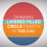
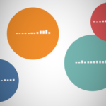
I created this bespoke data visualisation when I had more time and was more actively participating in #MakeoverMonday and for the UNESCO-IHE; I wanted to create a slightly different take on a stacked bar chart, so do have fun with this one.
Tutorial: https://tableau.toanhoang.com/drawing-layered-filled-circle-charts
2Layered Area Charts
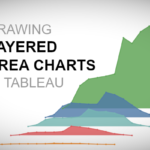
Just for some variety, check out this simple and fun blog about create Layered Area Charts in Tableau. We are literally using our data to draw the area chart using polygons, and then positioning them on the canvas. I hope you enjoy this and have loads of fun.
Tutorial: https://tableau.toanhoang.com/creating-layered-area-charts-in-tableau
3Gradient Pie Chart
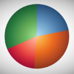
This is going to be a very exciting 2020 for Tableau Magic, and we truly hope you come along with us for the ride. To start off with, we are going to explore some techniques (data densification and table calculations) to create a Gradient Pie Charts in Tableau.
Tutorial: https://tableau.toanhoang.com/creating-a-gradient-pie-in-tableau
4Gauge Charts
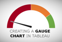
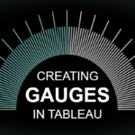
Another Tableau Tutorial request. Here is a tutorial on creating Gauges in Tableau. In this tutorial, we are going to show the colour-coded percentage out of 100.
Tutorial: https://tableau.toanhoang.com/creating-gauges-in-tableau
5Floating Bar Charts with Shaped Background
I have seen some amazing data visualisations using floating Worksheets, but a student asked me if we can create a floating bar chart effect in Tableau, so here we have it, our latest tutorial on creating Floating Bar Charts with a Shaped Background.
Tutorial: https://tableau.toanhoang.com/creating-floating-bar-charts-with-shaped-background
6Dendrogram with Rounded Bar Charts
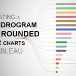
I am really having a fun moment with Dendrogram Charts, and in this tutorial, we are going to combine a Dendrogram Chart with Rounded Bar Charts to create a very nice looking effect. I hope you enjoy this tutorial and I cannot wait to see what you build using this.
Tutorial: https://tableau.toanhoang.com/creating-dendrogram-with-rounded-bar-charts-in-tableau
7Daisy Charts
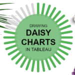
On my way home from the London Tableau User Group (TUG) I was looking at Twitter and got inspiration from Kevin Flerlage (@FlerlageKev) and Rajeev Pandey (@rajvivan), so I thought I would design and write up my own version of this visualisation, please welcome the Daisy Chart.
Tutorial: https://tableau.toanhoang.com/drawing-daisy-charts-in-tableau
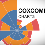
8Coxcomb Charts
I had this one on my radar for so long now, literally, ever since I ventured in Bespoke Data Visualisations in Tableau. A student requested this tutorial, so I thought I would share this with everyone. Enjoy.
Tutorial: https://tableau.toanhoang.com/creating-a-coxcomb-chart-in-tableau
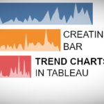
9Bar with Trend Charts
Sometimes, I will get an idea stuck in my head, an image, a type of data visualisation, and I will obsess about it until I have figured out how to create this in Tableau. The following is an example of this and based on feedback, I have written a tutorial about how to Create Bar Charts combined with a Trend.
Tutorial: https://tableau.toanhoang.com/creating-bar-with-trend-chart-in-tableau
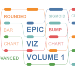
10#EpicViz Vol 1
This is going to be a longer post than most as I want to give you the full idea behind this visualisation as well as show you how to combine several techniques to build this most EpicViz. The idea for this visualisation hit me when I was writing a tutorial on how to build a Bump Chart and, while I this visualisation very useful, there was something missing.
Tutorial: https://tableau.toanhoang.com/tableau-magic-epicviz-vol-1
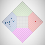
11Nolan Chart
I have been following the 2020 US election very closely, yes, it is still in the primary season, but I saw a Nolan Chart and thought that I had to create this in Tableau. So found this quite interesting, so hopefully, you will do as well.
Tutorial: https://tableau.toanhoang.com/creating-nolan-charts-in-tableau
12Path Chart
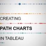
This is a tutorial that I have been wanting to write for over a year, however, the mathematics behind this really eluded me. Then one lazy Sunday, I decided to have a go at creating a Path Chart and was able to really simplify this technique and make it super generic. Seriously, I was surprised at the result and sure I will be using this more and more in my data visualisation. I really hope you enjoy this.
Tutorial: https://tableau.toanhoang.com/creating-path-charts-in-tableau
13Radial Jitter Bar Chart
I created this a while ago, and only now have had a chance to write a tutorial on creating Radial Jitter Bar Charts. Truth be told, I spent time digesting the easiest and cleanest way to achieve such an effect. I hope you enjoy this Monday Bespoke Data Visualization Tutorial.
Tutorial: https://tableau.toanhoang.com/creating-radial-jitter-bar-charts-in-tableau
14Radial and Rounded Bar Chart
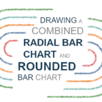
I was browsing Pinterests for interesting visualisations and came across a visualisation that combined a Radial Bar Chart with a Rounded Bar Chart, and as such, I knew that I had to give this a try in Tableau. Initially, I considered having two separate worksheets and putting them next to each other, but trying, I want to put into one worksheet, so do enjoy.
Tutorial: https://tableau.toanhoang.com/drawing-a-combined-radial-and-rounded-bar-chart-in-tableau
15Radial Stacked Bar Charts
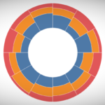
I saw this a while ago and thought that I would write a tutorial about creating Radial Stacked Bar Charts in Tableau; this is a Stacked Bar Chart based on Percentage of Totals but drawn in a circular shape. This was loads of fun to create, so I hope you really enjoy it.
Tutorial: https://tableau.toanhoang.com/creating-radial-stacked-bar-chart-in-tableau
16Sigmoid Area Chart
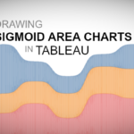
I was working on an update to our Curved Line Charts and thought about turning this onto a Curved Area Chart, or Sigmoid Area Chart. I am going to be exploring this a lot more, but I hope you enjoy this tutorial that leverages a secondary data source and data densification to draw this bespoke data visualisation in Tableau.
Tutorial: https://tableau.toanhoang.com/sigmoid-area-charts-in-tableau
17Spiral Column Charts
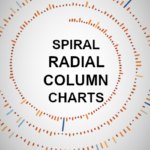
This is something that I have been wanting to create for a while, but alas, I put this on my backlog until I could figure it out. As such, I hope that you enjoy this tutorial on creating a Spiral Radial Column Chart in Tableau.
Tutorial: https://tableau.toanhoang.com/creating-spiral-column-charts-in-tableau
18Sprinkled Doughnut Charts
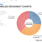
I have not written a tutorial on created Sprinkled Doughnut Charts yet, but I am sure that I will do for my second wave of tutorials. As such, I hope you do enjoy the following.
19Square Arc Charts
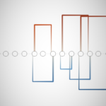
I hope you enjoy this last tutorial before I go on my first break of 2020. This is the technique that I used to create my Premier League Data Visualisation, which you can find here. I hope you enjoy this tutorial and look forward to writing more for you in May.
Tutorial: https://tableau.toanhoang.com/creating-square-arc-charts-in-tableau
20Square Spiral Columns Charts
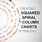
Two weeks ago, we released our Spiral Column Chart Tutorial in Tableau using the Line Mark Type. In this tutorial, we are going to create a Squared version using the Polygon Mark Type, so I really hope you enjoy this.
Tutorial: https://tableau.toanhoang.com/creating-squared-spiral-column-charts-in-tableau

