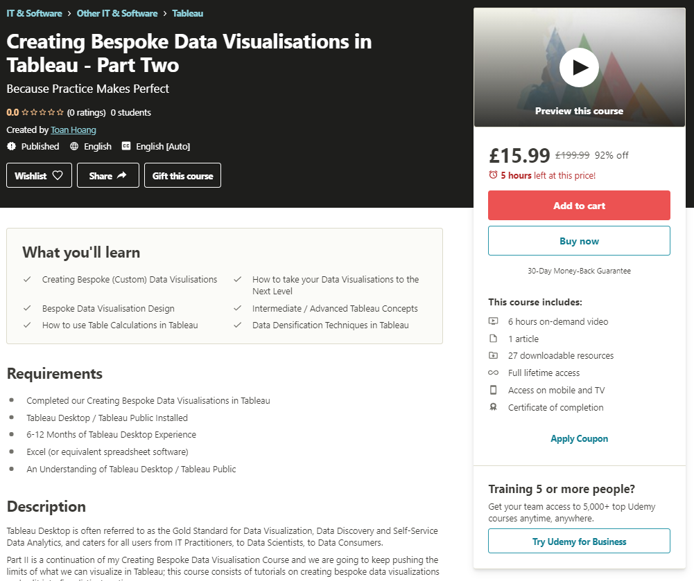
In July 2019, I released my course on Creating Bespoke Data Visualisations in Tableau on Udemy, the aim of this course was to provide more information, context to complement the huge number of blogs on Tableau Magic. Today, I am happy to announce that the second part of this course has now been released. I would like to welcome Creating Bespoke Data Visualisations in Tableau Part 2 – Because practice Makes Perfect.

About
This is a continuation course, assumes that you have either completed my first course or adept at creating Bespoke Data Visualisations, as this provides an opportunity for you to practice your techniques and refine your skills.
Course Prerequisites
- Completed our Creating Bespoke Data Visualisations in Tableau
- Tableau Desktop / Tableau Public Installed
- 6-12 Months of Tableau Desktop Experience
- Excel (or equivalent spreadsheet software)
- An Understanding of Tableau Desktop / Tableau Public
Course Content
The course is split into the following five sections:
- Creating Bespoke Point Charts
- Creating Bespoke Line Charts
- Creating Bespoke Jitter Charts
- Creating Bespoke Polygon Charts
- Creating Bespoke Miscellaneous Charts (added to quarterly)
What you will Learn?
- Creating Bespoke (Custom) Data Visualisations
- Bespoke Data Visualisation Design
- Intermediate / Advanced Tableau Concepts
- How to use Table Calculations in Tableau
- Data Densification Techniques in Tableau
- How to take your Data Visualisations to the Next Level
Summary
I am looking to create more opportunities to learn Tableau and will be creating more courses over the next 18 months. If you decide to take the course, I do hope that you enjoy it, and as always, please let me know what you think, what other courses you would like me to create, and how else can I help you in your Tableau journey.


