


")


Just for a little bit of fun before I take a month off blogging, yep, we all need a little break fro time to time, I decided to have some fun and to create a Curved Polar Chart in Tableau. I am not sure if and when I would use this, but it sure looks pretty, and I hope you will pick up some interesting techniques from this. Enjoy.
Note: This is an alternative type of data visualisation, and sometimes pushed for by clients. Please always look at best practices for data visualisations before deploying this into production.
Data
We will start by loading the Sample Superstore data into Tableau Desktop / Tableau Public.
Note: If you have Tableau Desktop, you can use the Sample data source, but if you are using Tableau Public, download and load the following data source.
Calculated Fields
With our data set loaded into Tableau, we are going to create the following Bins and Calculated Fields:
Path
IIF([Ship Mode]="First Class",1,102)Path (bin)
- Right-click on Path, go to Create and select Bins…
- In the Edit Bins dialogue window:
- Set New field name to Path (bin)
- Set Size of bins to 1
- Click Ok
Index
INDEX()-2Index (Segment)
INDEX()-1TC_Date Part
WINDOW_MAX(MAX(DATEPART("month",[Order Date])))TC_Sales
WINDOW_SUM(SUM([Sales]))TC_Total Sales
WINDOW_SUM(SUM([Sales]))TC_Percentage
[TC_Sales] / [TC_Total Sales]TC_Percentage (Adjusted)
[TC_Percentage] / WINDOW_MAX([TC_Percentage])TC_Next Percentage
IF ISNULL(LOOKUP([TC_Percentage (Adjusted)],1)) THEN
    LOOKUP([TC_Percentage (Adjusted)],-11)
ELSE
    LOOKUP([TC_Percentage (Adjusted)],1)
END
TC_Growth
([TC_Next Percentage]-[TC_Percentage (Adjusted)])/100TC_Step Size
3.6/12TC_Starting Point
([TC_Date Part]-1)*360/12X
IF [Index] = -1 THEN
    0
ELSE
    SIN(RADIANS([Index]*[TC_Step Size]+[TC_Starting Point]))*([TC_Percentage (Adjusted)]+([Index]*[TC_Growth]))
END
Y
IF [Index] = -1 THEN
    0
ELSE
    COS(RADIANS([Index]*[TC_Step Size]+[TC_Starting Point]))*([TC_Percentage (Adjusted)]+([Index]*[TC_Growth]))
END
TC_Size
IF [Index] = 0 THEN
    1
ELSE
    0
END
With this done, let us start creating our data visualisation.
Worksheet
We will now build our worksheet:
- Change the Mark Type to Polygon
- Drag Order Date onto the Filters Shelf, and filter to 2018
- Drag Order Date onto the Colour Mark; right-click on this pill and make sure that this is a Discrete Year
- Drag Order Date onto the Detail Mark; right-click on this pill and make sure it is a Discrete Month
- Drag Path (bin) onto the Columns Shelf
- Right-click on this pill and ensure that Show Missing Values is select
- Drag this pill onto the Path Mark
- Drag X onto the Columns Shelf
- Right-click on this pill, go to Compute Using and select Path (bin)
- Drag Y onto the Rows Shelf
- Right-click on this pill, go to Compute Using and select Path (bin)
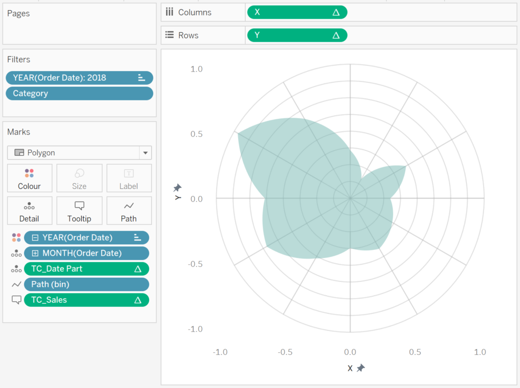
- Double click on the X and Y-Axis Headers and fix the values to be from -1.1 to 1.1
You should see the following:

We will now adjust the Table Calculation for X and Y:
- Right-click on the X-pill on the Columns Shelf and select Edit Table Calculation…
- In Nested Calculations select TC_Percentage (Adjusted)
- In Compute Using select Specific Dimension
- Check on Path (bin), Month of Order Date and Year of Order Date; ensure that Path (bin) is on top and Year of Order Date is on the bottom
- In Nested Calculations select TC_Total Sales
- In Compute Using select Specific Dimension
- Check on Path (bin), Month of Order Date and Year of Order Date; ensure that Path (bin) is on top and Year of Order Date is on the bottom
- In Nested Calculations select TC_Next Percentage
- In Compute Using select Specific Dimension
- Check on Path (bin), Month of Order Date and Year of Order Date; ensure that Path (bin) is on top and Year of Order Date is on the bottom
- In Nested Calculations select TC_Percentage (Adjusted)
- Right-click on the Y-pill on the Rows Shelf and select Edit Table Calculation…
- In Nested Calculations select TC_Percentage (Adjusted)
- In Compute Using select Specific Dimension
- Check on Path (bin), Month of Order Date and Year of Order Date; ensure that Path (bin) is on top and Year of Order Date is on the bottom
- In Nested Calculations select TC_Total Sales
- In Compute Using select Specific Dimension
- Check on Path (bin), Month of Order Date and Year of Order Date; ensure that Path (bin) is on top and Year of Order Date is on the bottom
- In Nested Calculations select TC_Next Percentage
- In Compute Using select Specific Dimension
- Check on Path (bin), Month of Order Date and Year of Order Date; ensure that Path (bin) is on top and Year of Order Date is on the bottom
- In Nested Calculations select TC_Percentage (Adjusted)
You should now see the following:

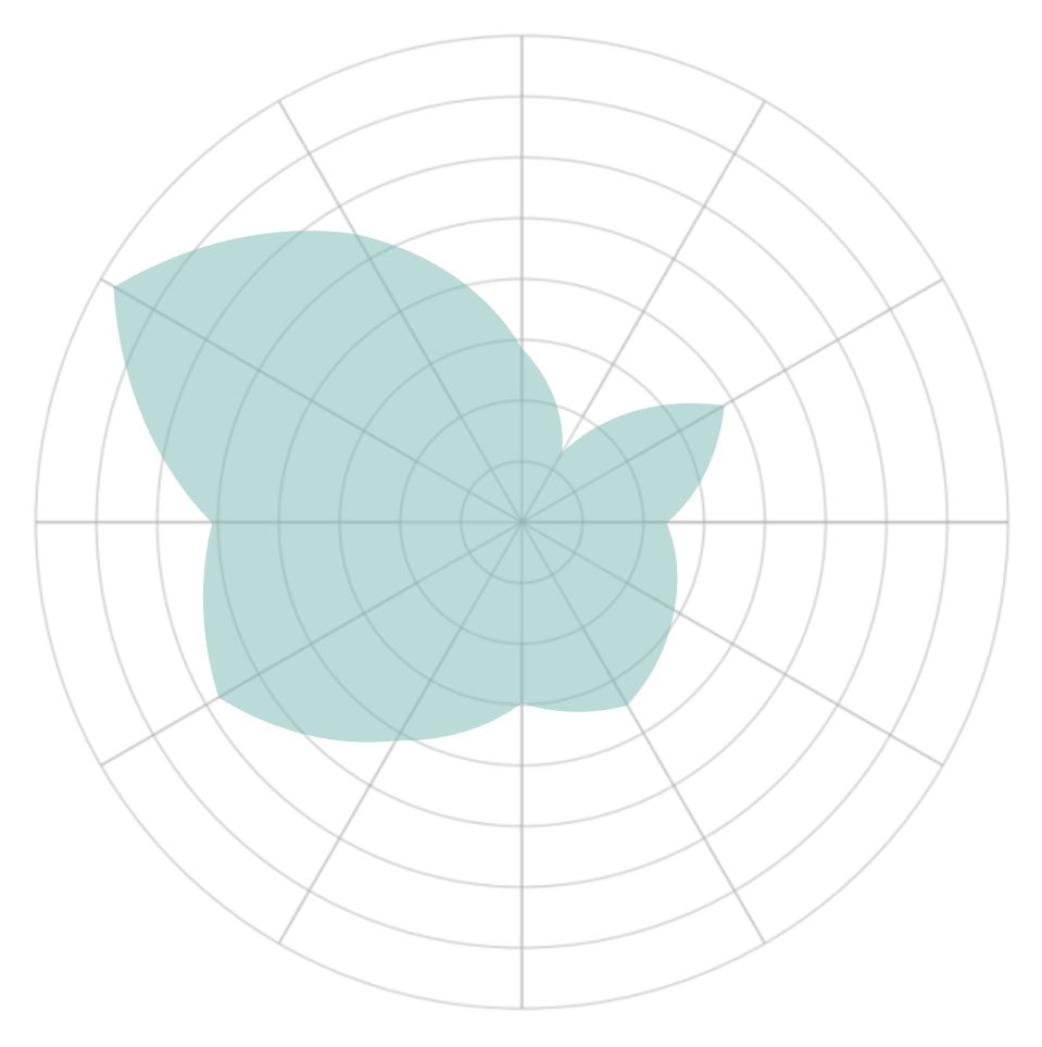
We will now add a background image to our Worksheet:
- Download the following image: HERE
- In the Application Menu, go to Map, Background Images and then select Orders…
- Click on Add Image…
- In File or URL select the downloaded image.
- In the X Field select X and set Left to -1.1 and Right to 1.1
- In the Y Field select Y and set Left to -1.1 and Right to 1.1
- Click OK
You should now see the following:
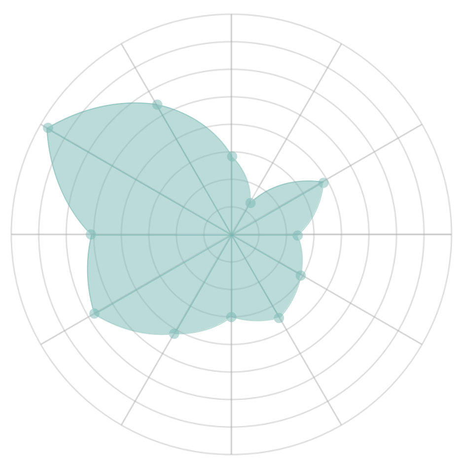
We will now adjust the cosmetics to finalise our data visualisation:
- Hide the Grid Lines
- Hide the Zero Lines
- Hide the Row Dividers
- Hide the Column Dividers
- Hide the X-Axis and Y-Axis Header
- Set the Colour Opacity to 50%
- Set the Tool Tips
You will finally end up with the following:
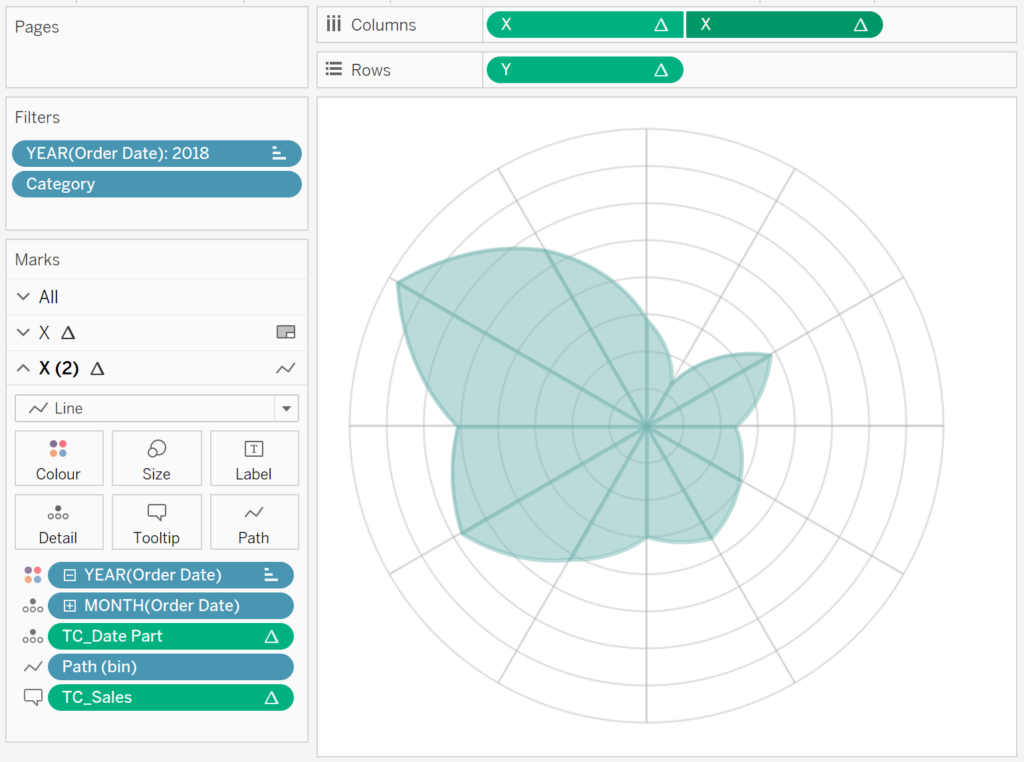
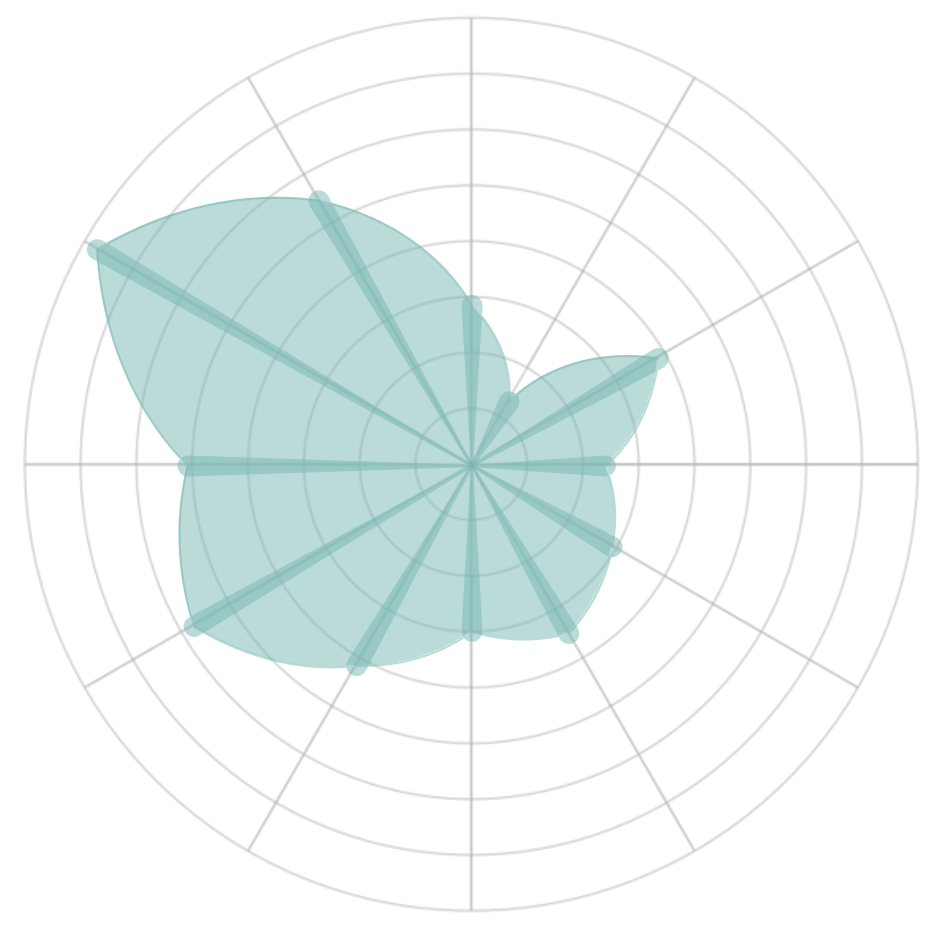
Now we will have some fun and add a line…
- Ctrl Drag and Drop the X-Pill to the right (to duplicate this pill)
- Right-click on this pill and select Dual Axis
- Right-click on the Axis Header and select Synchronize Axis
- Hide the Axis Header
- In the X (2) Mark Panel
- Change the Mark Type to Line.
You should have the following:
Lets have some additional fun:
- On the X (2) Marks Panel
- Drag TC_Size onto the Size Mark
- Right-click on this pill, go to Compute Using and select Path (bin)
You will see the following:
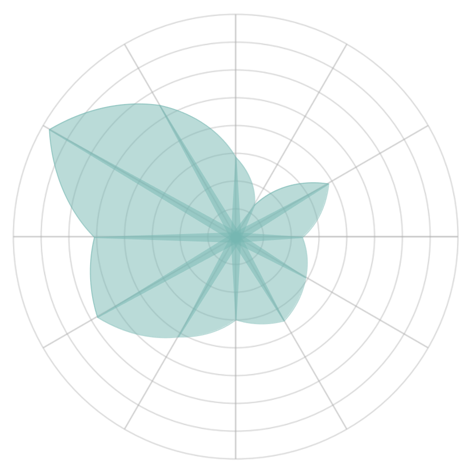
A little more fun, so let us change the TC_Size Calculated Field:
IF [Index] = 1 THEN
    1
ELSE
    0
END
You will have the following:
One last piece of fun, let us change the TC_Size Calculated Field:
IF [Index] = -1 THEN
    1
ELSE
    0
END
We should finally have the following:
and boom, we are done! I hope you enjoyed creating this data visualization and learned some cool techniques as well. As always, you can find this data visualisation on Tableau Public at https://public.tableau.com/profile/toan.hoang#!/vizhome/CurvedPolarCharts/CurvePolarChart
Summary
I hope you all enjoyed this article as much as I enjoyed writing it and as always do share the love. Do let me know if you experienced any issues recreating this Visualization, and as always, please leave a comment below or reach out to me on Twitter @Tableau_Magic. Do also remember to tag me in your work if you use this tutorial.
If you like our work, do consider supporting us on Patreon, and for supporting us, we will give you early access to tutorials, exclusive videos, as well as access to current and future courses on Udemy: https://www.patreon.com/tableaumagic


")

")


Hi Toan! This is great, thank you for the tutorial
I have a question, imagine you have a total sales % by country. How it would be possible to have the countries instead of the months, and the % of the total instead of the actual sale?
Thank you!
Dani
Yes, it would be possible. It just means it means create an index for country instead of the date part.