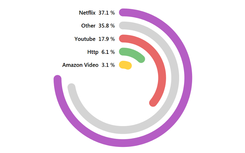
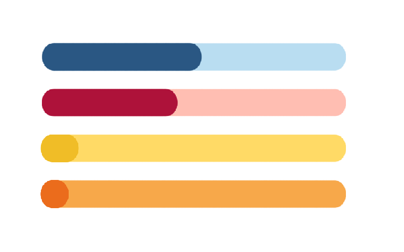
Drawing Curved Bar Charts in Tableau
I was having a quiet weekend and thought I would have a little fun with some bar chart variations, as such, I played around with creating Curved Bar Charts in Tableau....
Petal Charts in Tableau
I struggled to find the appropriate name for this chart type and it bugged me quite a bit. On one hand, should this be called a petal chart or should this...
Video: Tableau with Music / Half-Circle Timelines
Tableau with Music / Half-Circle Timelines. We will combine several Table Calculations to create this visualisation using the Sample Superstore Data Set. Nice and simple.
https://youtu.be/XnH-jqedyKM
Written Tutorial
YouTube Channel
Tableau QT: Error Margin
On Thursday 12th December the UK had a General Election. On Wednesday 27th November YouGov released its MRP poll which gave a break down of the estimated votes shared by Constituency...
Tableau QT: HEXBIN Charts
Last week we released a tutorial about the new Distance function in Tableau 2019.3; I really love this function and can see so many interesting applications. This week we are going...
TAB102 / Installing and Exploring Tableau
In this tutorial, we will install the 14-day trial for Tableau Desktop, walk through the User Interface, and build our first dashboard. This might sound like a lot of content, but...
Creating Pointed Podium Bar Charts in Tableau
A few weeks ago I created a tutorial for making a Podium Bar Chart. This week we are going to draw a Point Podium Bar Chart in Tableau using Polygons. I...
Creating Spiral Hex Charts in Tableau
I thought I would have some fun and create a challenge for myself and create a Spiral Hex Chart in Tableau. Unfortunately, while I was not able to fully make this...
Tableau QT: Thermometer Chart
This is a Quick Tip on how to build a Thermometer Chart in Tableau, so less reading and more jumping in. We are going to spend 5 minutes or less building...
Tableau QT: Shape Bar Chart
This is a Quick Tip on how to build a Shape Bar Chart in Tableau, so less reading and more jumping in. We are going to spend 5 minutes or less...

