Drawing Layered Filled Circle Charts
I created this bespoke data visualisation I had more time and more actively participating in #MakeoverMonday and for the UNESCO-IHE. I wanted to create a slightly different take on a stacked...
Creating Ternary Plots in Tableau
This is my last tutorial until I go on my August Tableau Magic break, and as such, I want to finish with a comprehensive tutorial on creating Ternary Plots in Tableau;...
Tableau Magic on Udemy
After months of planning, endless preparation, and loads of refilming, I am finally ready to make public my first Udemy Course on Creating Bespoke Data Visualisations in Tableau. Since starting Tableau...
Sectioned Radial Jitter Plots in Tableau
In the recent 2nd #IronViz Feeder round for the Global competition, I created a sectioned Radial Jitter plot, which was adapted from the Tableau Magic Circular Jitter Plot tutorial. You can...
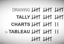
Drawing Tally Charts in Tableau
For me, it is important to try new things with Tableau and to push my creativity and skills. As such, here is a nice and simple tutorial on Drawing Tally Charts...
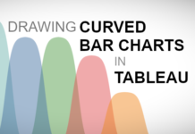
Drawing Curved Bar Charts in Tableau
I was having a quiet weekend and thought I would have a little fun with some bar chart variations, as such, I played around with creating Curved Bar Charts in Tableau....
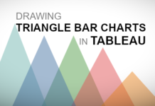
Drawing Triangle Bar Charts in Tableau
Last week, I was playing around with bar chart variations and created Curved Bar Charts and thought I would also try to create Triangle Bar Charts as well. As noted in...
Tableau and Python / An Introduction
Today, Python is one of the most sought after skills in the world of Data Science, and as such, we can leverage this power in our Tableau Data Visualisations. While integration...
Sigmoid Area Charts in Tableau
I was working on an update to our Curved Line Charts and thought about turning this onto a Curved Area Chart, or Sigmoid Area Chart. I am going to be exploring...
Arrow Doughnut Chart
I saw the following data visualisation and thought that I had to create it, but once I created this I had no idea what I would call it. Baseball Stitches, Chevron...

